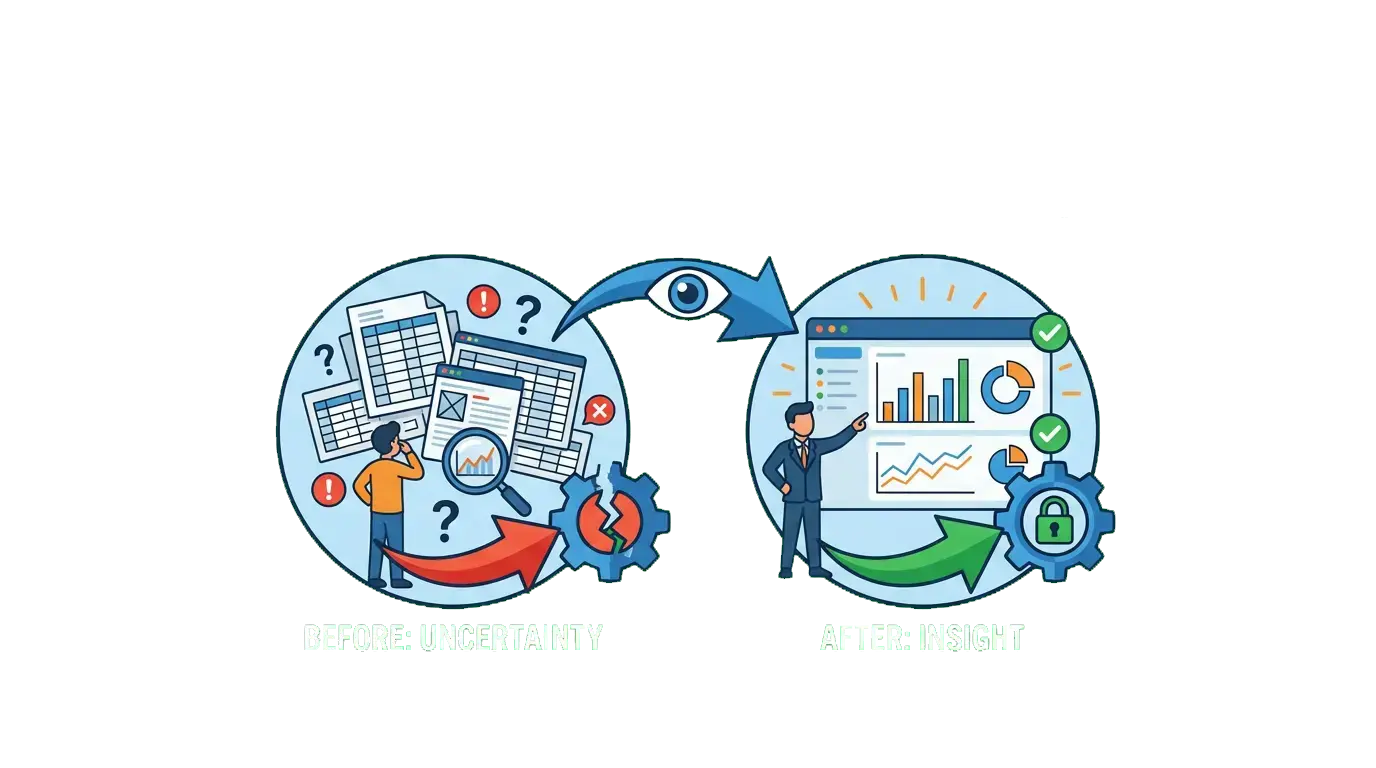
How Visual Analytics Reduces Mistakes in Business?
Imagine you are given a thousand-page book consisting only of black numbers and complex codes to find out who the criminal is. You would get lost in those numbers, lose hours of time, and most likely blame the wrong person without even realizing it. Now, imagine that same complex story is shown to you as a clear, colorful, and engaging two-hour movie. Massive databases in modern business are that thousand-page book of numbers. Visual analytics is the lead director who turns these complex numbers into a "movie" that everyone can understand. Today, the biggest (and most expensive) mistakes made by company leaders and managers when making decisions stem not from a lack of information, but from the inability to correctly "see" the information they have.

From Numbers to Visuals: Key Advantages
Data visualization is not just about making reports look "prettier"; it is a strategic risk management tool directly linked to how the human brain perceives information. Let’s look at how visual analytics prevents errors:
- Rapid Digestion of Information: Science proves that the human brain processes visual information 60,000 times faster than written text and tables. You might look at an Excel spreadsheet with tens of thousands of rows and realize that sales have dropped sharply only hours later, after a delay. However, a red-colored graph suddenly dipping downwards informs you of the danger in seconds, without leading to an error.
- Instant Detection of Anomalies: A small typo in a table, an unexpected loss, or a case of fraud can easily hide in a sea of numbers. Visual analytics, on the other hand, immediately brings such anomalies to light through unusual "bulges" in graphs or contrasting colors. Thus, a small mistake is resolved on the spot before it turns into a major financial crisis.
- Common Language Within the Team: Marketing, sales, and accounting departments often read the same information in different forms and draw different conclusions. Interactive dashboards, however, create a common, understandable language for all departments. When everyone looks at the same graph, they see the same picture, which minimizes misunderstandings and interdepartmental coordination errors.
Statistics: The Power of Visuals Doesn't Lie
Global statistics showing how visual tools reduce errors in business reveal the true power of visual analytics:
- Sharp Reduction in Errors: According to international research, companies that switch from traditional text and number-based reports to full visual dashboards see critical errors in the decision-making phase reduced by up to 40%. Inattention caused by the human factor drops to a minimum.
- Speed of Finding Information: Based on data from leading analytics institutions, managers find the strategic information they need 28% faster using interactive visual interfaces compared to traditional tables. This speed prevents taking the wrong step during moments of crisis.
- Return on Investment (ROI): Research proves that the profitability level organizations achieve from projects where they actively use data visualization tools is, on average, 24% higher than those using standard (non-visual) methods.
From Complexity to Simplicity: An Evolutionary Chronology
So, how did we get from "drowning in a sea of numbers" to today's clear graphs?
- 2000s (Infinite Rows): Managers were condemned to endless Excel spreadsheets overflowing the screen. A single incorrectly written formula or a single overlooked cell could ruin an entire monthly report and the decision based on it.
- 2015-2020 (Dashboard Revolution): With the popularization of revolutionary tools like Tableau and Power BI, businesses were introduced to "living" data. Instead of searching for the answer to the question "Which product brought a loss this month?", management evaluated the situation in seconds by looking at the red zone on the screen.
- 2025 and beyond (Interactive and Storytelling Visuals): Graphs are no longer just static images. Modern visual analytics integrated with Artificial Intelligence (AI) allows us to ask questions. You ask the screen, "Why did expenses increase last week?", and the system automatically draws a sequence of graphs explaining the problem and its causes visually.

Visual Analytics Reality in Azerbaijani Business
The application of visual analytics in our country, especially in the local business environment, is progressing at different speeds. On one hand, Azerbaijan's advanced bank sector and large e-commerce platforms actively use visual analytics. By visualizing millions of transactions with tools like Power BI and similar software, they reduce credit risks, immediately detect fraud cases through visual anomalies, and thus prevent thousands of manats in errors that could occur every day.
On the other hand, many SMEs (Small and Medium Enterprises) are still trying to manage through "WhatsApp reports" and complex tables. Due to the lack of data visualization, critical management errors such as incorrect calculation of warehouse balances, wrong demand forecasting, and spending of ineffective advertising budgets occur. However, the sharp decrease in the prices of cloud-based visual analytics software has now made this technology accessible even for the smallest companies.
Visual analytics is not just the art of turning boring numbers into colorful diagrams to "decorate" presentations. It is a warning system that protects your company from accidents. If you cannot see your data clearly, it means you are moving at high speed in foggy weather — and in such a situation, an accident is inevitable. Visual analytics clears that fog, shows mistakes before they even occur, and creates an opportunity for your business to grow safely.